Realtime Collaboration Platform
Bluescape is both an online collaboration tool and a hardware platform. It supplies both a dedicated virtual space and wall-sized screens to host them, saving Bluescape users from ever having to write DO NOT ERASE on a whiteboard again. In addition to drawing, they can drop videos, web pages, documents and sticky notes into the space. It’s a powerful platform with massive potential.
Bluescape was operating in startup mode, so my work was primarily designing features requested by users due to rapid adoption across several industries. I’ve included several examples of this type of incremental work below.
Designing Upload Behavior
This part was easy - a single large upload with a progress indicator
The Challenge
At first glance, it seemed simple enough, but a few things made this project different from most upload flows:
Bluescape’s uploads are often huge.
Many customers in the film industry upload scores of massive video files simultaneously, so uploads can take a while to complete.
Arranging and layering objects is a core behavior of the product and users shouldn’t have to wait to get started.
It’s a huge workspace - when users zoom out to work in another part of the space, their work can often become a tiny scintilla on a wall-sized screen, or even shrink below the threshold of a single pixel and disappear.
The Design
My design strategy took the following into consideration:
Because large uploads required significant time to complete, users needed to manipulate their uploads before they were completed
Because uploads took time to complete and sometimes encountered problems users needed to monitor their progress and status.
Because their attention might be anywhere in the workspace, users needed both general and contextual upload notifications.
Because it was easy to lose new uploads by zooming out, users needed to locate and navigate to their uploads easily.
Things are more interesting with multiple files, an error, and both completed and unfinished uploads.
To meet the first requirement:
I designed placeholders to enable users to organize their files while they uploaded. Matching a simple placeholder’s aspect ratio to the one in the upload’s metadata gave us the right shape and allowed the placeholder to follow all of our established object manipulation behaviors with no changes needed after it completed.
To meet the second requirement:
I designed a contextual indicator within the placeholder to show the upload’s status and progress.
To meet the third requirement:
I designed a global upload progress indicator which is integrated with the side nav and corresponding flyout.
To meet the final requirement:
I designed a system to utilize the upload menu flyout as a navigation tool. Users can select the upload’s indicator to immediately jump to that upload’s location within the workspace. (With zoom set relative to the size of the viewport)
User’s can also cancel, retry or delete any upload they’ve made since logging in.
The design works well because necessary information is revealed when it’s needed, but hidden when it’s not. Also, uploads are easy to find and track so nothing falls through the cracks.
First Impressions: Setting up the System
The Challenge
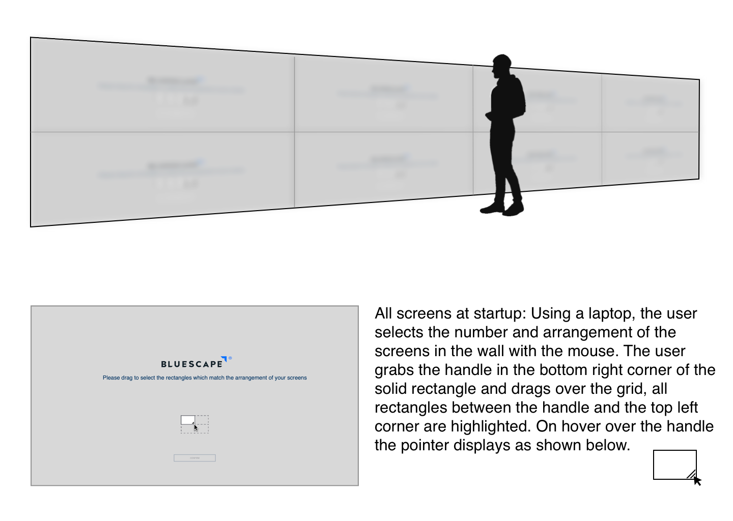
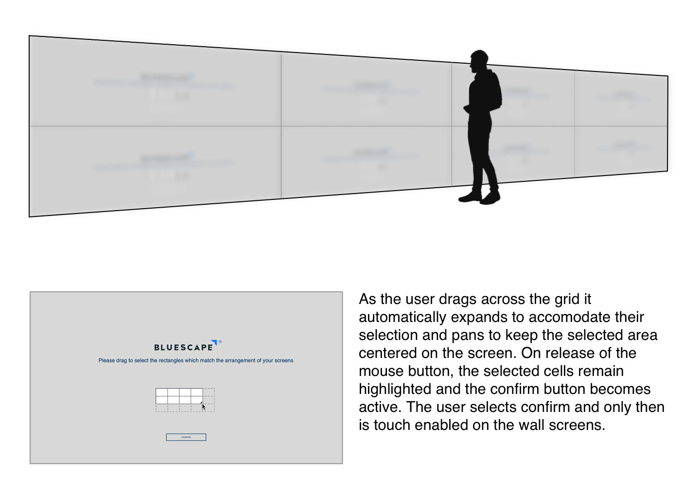
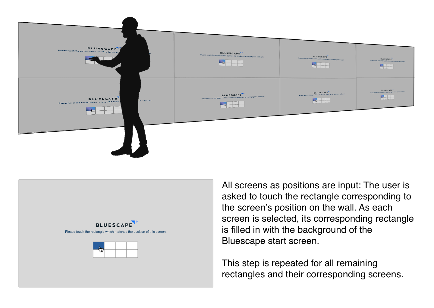
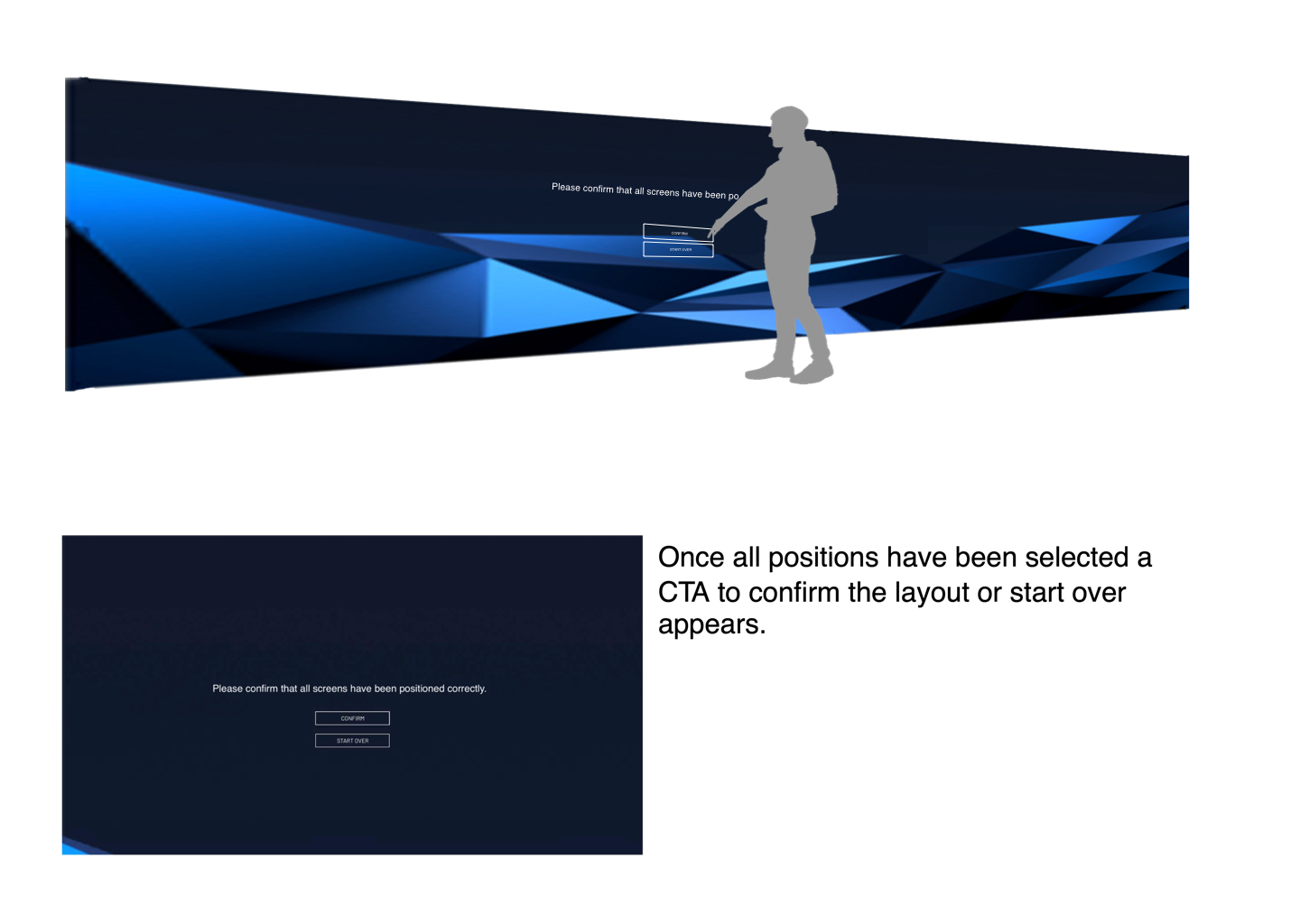
When configuring a Bluescape wall for the first time, the system needs to be taught where the screens are tiled in relation to one another. The existing tool required a technician to laboriously enter each monitor’s unique identifier into a script. It wasn’t efficient, and it definitely wasn’t a “wow moment” for customers seeing our product in action for the first time.
The Design
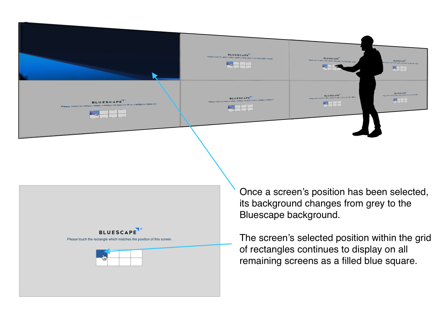
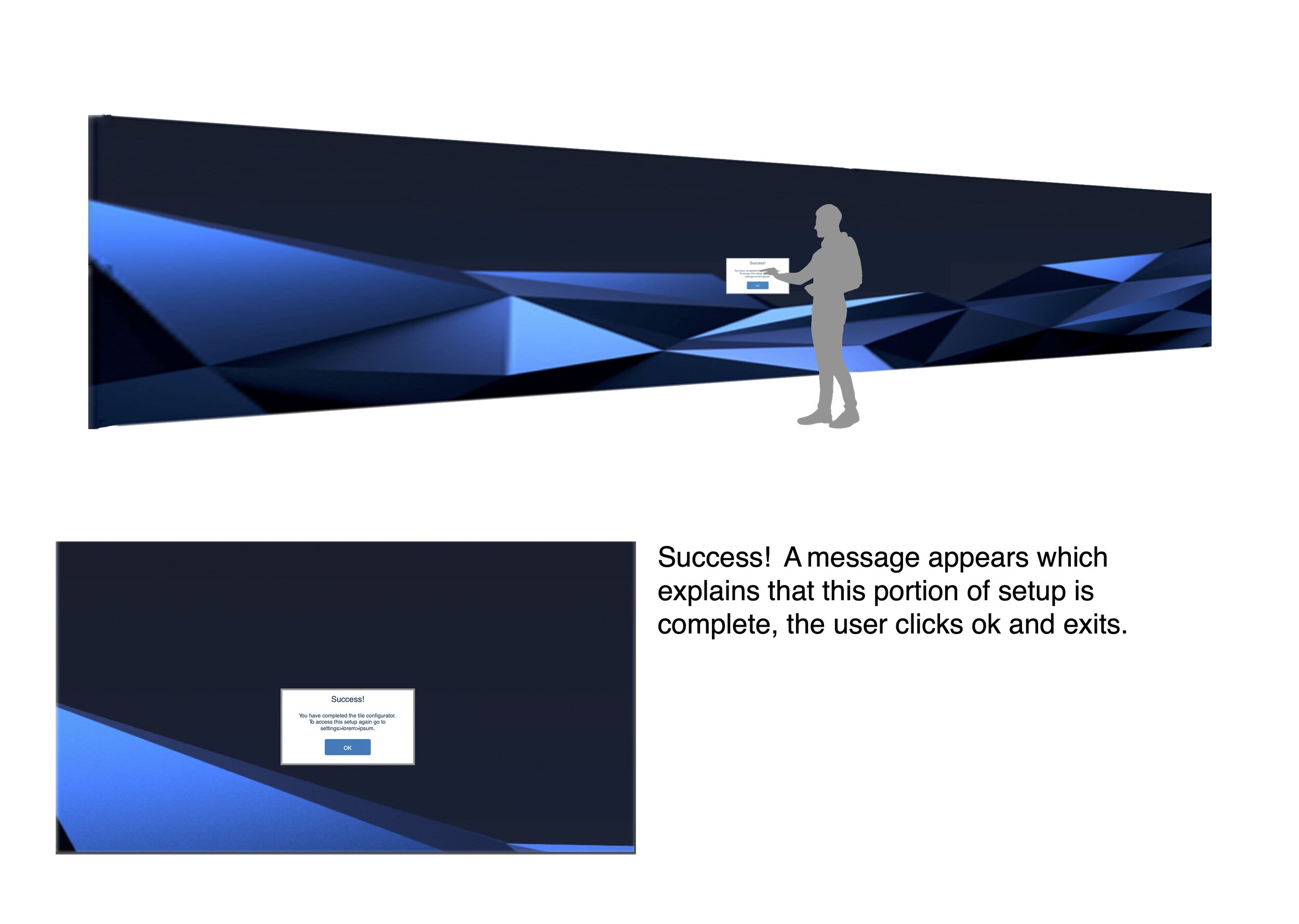
Naturally I wanted to show users how simple and intuitive our platform could be, so I designed a new experience where each screen is assigned with a single touch. As the setup is completed, the Bluescape logo and background emerge like pieces to a puzzle filling it in to reveal a whole. The setup process has been transformed from tedious and technical to a satisfyingly simple experience which can be shared with new customers as an empowering introduction to the platform.
Inviting Collaboration
The Challenge:
At Bluescape, large clients utilize many complex spaces. It creates interesting challenges for managing user access and privileges. For instance, a user might be participating in a whiteboarding session, within a WebEx meeting, taking place within a workspace, within an organization, within the Bluescape platform. Compounding this, organizations often have thousands of users, and hundreds of workspaces.
Controlling access to these spaces is important, but for spontaneous collaboration to happen it also needs to be simple and intuitive. User permissions were handled exclusively by a form-and-table admin tool outside the workspace, which forced users to exit their session in order to invite collaboration. That needed to change.
Shown side-by-side here is the participant list for a WebEx meeting within a workspace next to the active participant list for the workspace itself.
The strategy
User roles needed to be organized hierarchically in order for users to make sense of them. When inviting collaborators, users needed to know who was “in the room”, who was “in the building”, and who was “outside but had a set of keys”.
For instance, in a scenarios where a user needed additional whiteboarding input, they needed to know who was “nearby” and available to join.
I designed user lists in realtime-oriented spaces to include only those “nearby” in the enclosing workspace. Those within that space can easily be notified they are needed (Bonus: they are likely to be engaged with the same issues.)
Conversely, in a scenario where a user needs to invite an absent or outside user, it’s better done via an email invitation. As such, these users are not shown in meeting and whiteboard user lists as they may be away, busy, or unauthorized for the space.
The Design:
After mapping a user management strategy I was able to designed a pattern applicable to multiple levels of organizational hierarchy.
In order to allow users to invite collaboration without breaking their workflow, I brought limited user-management tools into the workspace. (Heavy lifting like bulk-access granting etc. were to be handled in a new streamlined admin tool).
My designs for implementing this pattern at the workspace level are shown to the right.
Thanks for reading! What else can I show you? How about a start-to-finish project?
